

Have you ever asked how the selection of the best colors for business cards will create a significant impact on how customers perceive your brand? Your card's color choices will determine its ability to build trust and make a memorable sight. The current design trend–which favors vibrant color schemes and deliberate color differences–requires businesses to choose their colors carefully because this practice helps them achieve better visibility in highly competitive fields, particularly in Dubai where business cards remain a crucial tool for professional connections.
How Color Affects First Impressions on Business Cards?
Your brand receives subconscious evaluation through color, as it affects how people perceive it. Research demonstrates that using correct color palettes establishes emotional bonds while supporting message delivery. Your card development process begins with selecting the correct color palette which determines whether your card appears professional or displays elements randomly.
A well-chosen color communicates: Professionalism, brand personality, industry relevance, emotional tone. That's why picking the best colors for business cards becomes a must.
Most Professional Business Card Colors by Industry
Different industries lean toward different tones because color influences expectations.
-
Financial institutions and legal organizations use navy, charcoal and black as their primary colors.
-
The healthcare sector uses white, teal and soft blue colors.
-
Real estate professionals usually use gold, deep green and burgundy color palettes.
-
Tech companies and startup businesses use electric blue, gradients and strong color differences for their design needs.
-
Creative agencies use active color schemes together with neon highlights and artistic color combinations.
The selected options create connections between audiences and their hidden understanding of trustworthiness, modernity and inventive thinking. There's no wonder that every printing company in dubai covers these aspects when providing their services.
What Is the Best Background Color for Business Cards?
Business cards require specific background colors which create readable content while showing the brand's identity. The best background color for business card are neutral tones which include white, black and soft grey, whereas bold backgrounds need high-contrast text for effective use.
The following background options show their respective functions:
-
White (clean, minimal, corporate)
-
Black (luxury, premium, modern)
-
Navy (trustworthy, professional)
-
Cream (warm, elegant)
-
Deep green (sophisticated, earthy)
Before finalizing your background color, make sure you're using the correct business card size dimensions to keep your layout balanced.
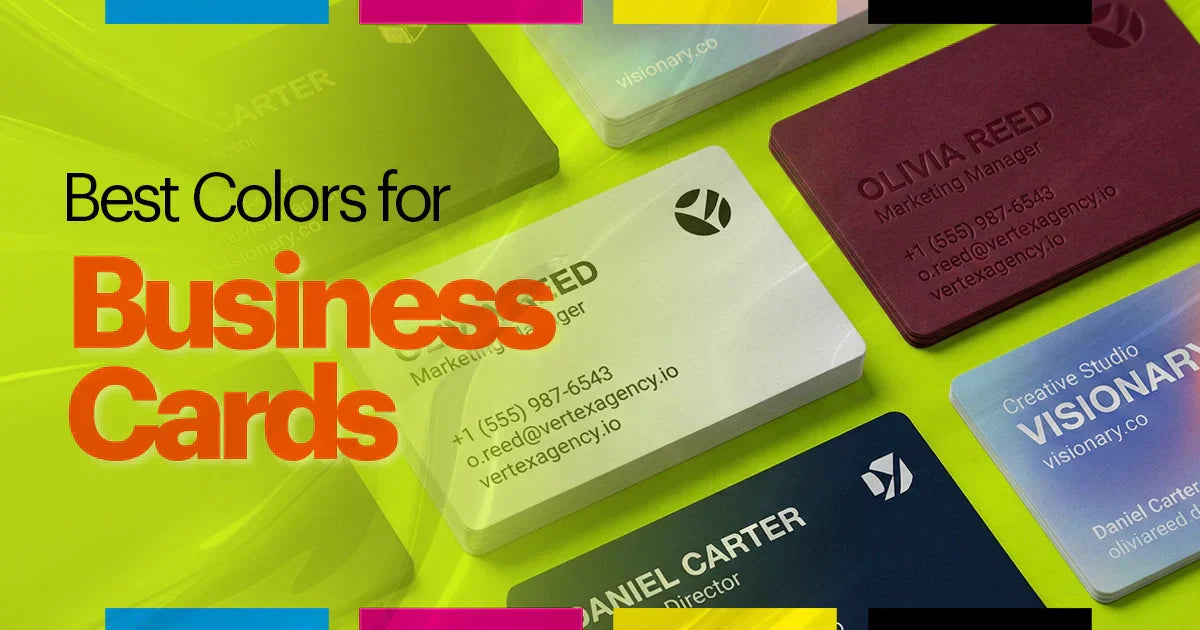
Business Card Color Combinations That Actually Work
According to experts in digital printing dubai service, the best business card color combinations achieve both emotional effect and contrast.
The following color blends are popular:
-
Black + Gold
-
Navy + White
-
White + Red
-
Teal + Charcoal
-
Beige + Brown
-
Blue + Orange
-
Black + Silver
The selected combinations maintain clarity while prompting brand visibility.
Color Combinations to Avoid (That Make Cards Look Cheap)
Some palettes reduce professionalism or create difficulties in reading text.
The following color combinations should be avoided:
-
Yellow text on white
-
Red text on black (unless bold and thick)
-
Neon backgrounds with thin fonts
-
Low contrast pastel combinations
-
Too many colors
Such designs create visual problems because they appear either too busy or too aggressive to the eye.
Font Size for Business Cards: The Guide to Perfect Typography
Which Colors Give a Luxury or Rich Look?
Luxury brands use deep, rich tones together with metallic accents for their design elements. The primary luxury colors include: black, deep emerald, burgundy, royal blue, gold foil, silver foil.
These shades create premium appearance which matches textured papers and Spot UV finishes. All mentioned terms show that the process of choosing the best colors for business cards is not a secondary thing, but very necessary for any business trying to launch or re-brand. Business card printing in UAE professional companies take this into account while they customize the best colors for business cards for their clients.
How Paper Type and Finish Change the Final Color Result?
Paper and finish can really alter how colors are going to appear:
-
Matte: Softens colors, reduces glare
-
Glossy: Makes colors vibrant and saturated
-
Velvet touch: Adds richness and depth
-
Textured paper: Slightly mutes colors
-
Spot UV: Highlights specific elements with shine
-
Foil stamping: Adds metallic luxury
This is especially important when using digital printing services or working with a printing company in dubai.
Best Paper for Business Cards: A Simple Buyer's Guide
Color Psychology and Business Cards
Color psychology helps brands choose shades that evoke the right emotions. Research shows people keep colorful business cards up to ten times longer than plain ones. Business card color combinations create a feeling that companies want to convey.
Meaning of common colors:
-
Blue — Trust, stability
-
Red — Energy, urgency
-
Green — Growth, balance
-
Black — Power, sophistication
-
White — Purity, clarity
-
Yellow — Optimism, creativity
-
Purple — Luxury, imagination
Choosing colors aligned with your brand message increases memorability.
How to Choose the Right Color for Your Brand?
Use this simple approach:
-
First you should establish your brand identity
-
Next you should examine the standard practices of your industry
-
Select two main colors for your design
-
Choose one additional color for your design as an accent color
-
Create high contrast elements that users can easily read
You should evaluate your color palette on both digital platforms and print materials.
This way, the design of your card will maintain its visual appeal because it works well with both digital printing and traditional offset printing methods.
Common Color Mistakes When Designing Business Cards
Avoid these frequent errors:
-
Using too many colors
-
Poor contrast between text and background
-
Ignoring how colors print vs. how they appear on screen
-
Choosing trendy colors that don’t match your brand
-
Forgetting cultural color meanings (important in UAE markets)
Ready to Print Business Cards with the Perfect Color? MaxPrint
MaxPrint offers premium business card digital printing service with accurate color reproduction, high-quality materials, and professional finishes. Whether you prefer matte, glossy, velvet, foil, or Spot UV, MaxPrint ensures your chosen colors look sharp and consistent.
Choose from multiple quantities, fast turnaround, and expert support from a trusted printing company in Dubai.
Bring your color vision to life, print your business cards with MaxPrint today.
Contact us to explain everything for you, from the best background color for business cards to design consultations.
FAQs
What are the best colors for business cards?
Several colors have reserved their place nowadays as the optimal choice. Black, navy, white, gold, and deep green are rated as the most effective.
Which business card color combinations work best?
Some colors such as black with gold, navy and white, and blue combined with orange are proven to be visually appealing and memorable.
Do colorful business cards perform better?
Yes. People keep colorful business cards up to ten times longer than plain ones, increasing brand recall.
What is the best background color for business cards?
White, black, and navy are the most versatile and professional backgrounds, offering strong contrast for texts.
How does color psychology affect business card design?
Colors influence emotions, and that's something that businesses should take into consideration to leave the desired impact from business cards.
Should I match my business card colors to my logo?
Yes. Your business card should support your brand identity, and color consistency is key to recognition.


